Happy collector Kayla Watson capturing all the vibes from Color Cloud 6: Leave It Open & Color Cloud 13: It’s Right There For You in her extremely lovely minimalist bedroom.
Thanks for this amazing pic Kayla!!!
Happy collector Kayla Watson capturing all the vibes from Color Cloud 6: Leave It Open & Color Cloud 13: It’s Right There For You in her extremely lovely minimalist bedroom.
Thanks for this amazing pic Kayla!!!

About four years ago, I got really serious about taking care of my mental health. Started therapy and dug in. I’m so glad I did! (And yes, I’m still going and it’s still a really important part of my life.)
One thing I learned (and just keep on learning) as I worked to address my mental health is that physical and mental health are 100% interconnected. In case you’re wondering, yes, I had known this before, but I keep conveniently forgetting it because tbh I’d rather live in my mind than in my body. Since that’s not possible….
Taking care of our bodies gives us the energy, power and joy we need to do literally everything else we want to do - and the ability to do those things longer and better and faster.

Okay, so we know this. But why is it so hard to do anything about it? (At least it is for me!)
I consistently find myself on the strugglebus with this, so I’m trying something new as an experiment. Rather than wasting my energy 1) trying to remember what the things are I should be doing everyday to take care of my body, 2) trying to do too many things and getting totally discouraged, and 3) giving up and feeling bad for not doing any of them, I made this visual self-care plan for me, and, if you want it, for you.
These are the five things (just five!) that I already KNOW make me feel way, way better. How do I know? Because when I’ve done them regularly, I felt way, way better. ;)
My hypothesis is that not only will I enjoy looking at this gameplan because it’s purty, I may also respond better to this list of five (again, just five!) things to endeavor to do every day because I have cleverly avoided the words exercise, water, meditation, gratitude and breathing (even though that’s definitely what the five things are) because they’re trigger words that spark eye rolls and guilty feelings for me.
At any rate, I’ll be posting this up in my workspace tomorrow, and we’ll see. Will I beat myself up if I don’t use it? No. Will I work on finding other ways to do these same five things every day if this doesn’t work for me? Yes. We live, we learn.
Click here or on the image below to download your own gameplan and shoot me an email or DM me on Instagram and let me know whether/how it’s working for you!
Greetings from the fake flower aisle at the Dollar Tree! More proof that, as Madonna wisely said, beauty’s where you find it. Also more proof that I am such a freaking sucker for color. Have a colorful day! :)

Hair in a bun, gettin’ things done - that’s a thing people say, right?✌️Studio times today - getting your orders going (🙏) updating the website & just maybe making some clay stuff for funsies.
Nothing like having too much to do to make me want to do more....🙄 Happy Sunday to you, take care out there ❤️

Power Color 3: Everything Intersects in the Burgandy to Red and Blush to Crimson colorways side by side here. I’d love to hang out on this couch. I’d love to hang out on any couch other than my own couch for a while tbh, but we are hard core distancing because, you know, pandemic. And like the title of these pieces, everything intersects and we’re all interconnected so let’s take care of each other. ❤️
Need these in your life as an ongoing reminder of how we all belong to each other while enjoying an energizing boost of color? Pieces start at $50 for unframed 10x10” - head over to see these and the entire Power Color collection. Happy Saturday y’all.

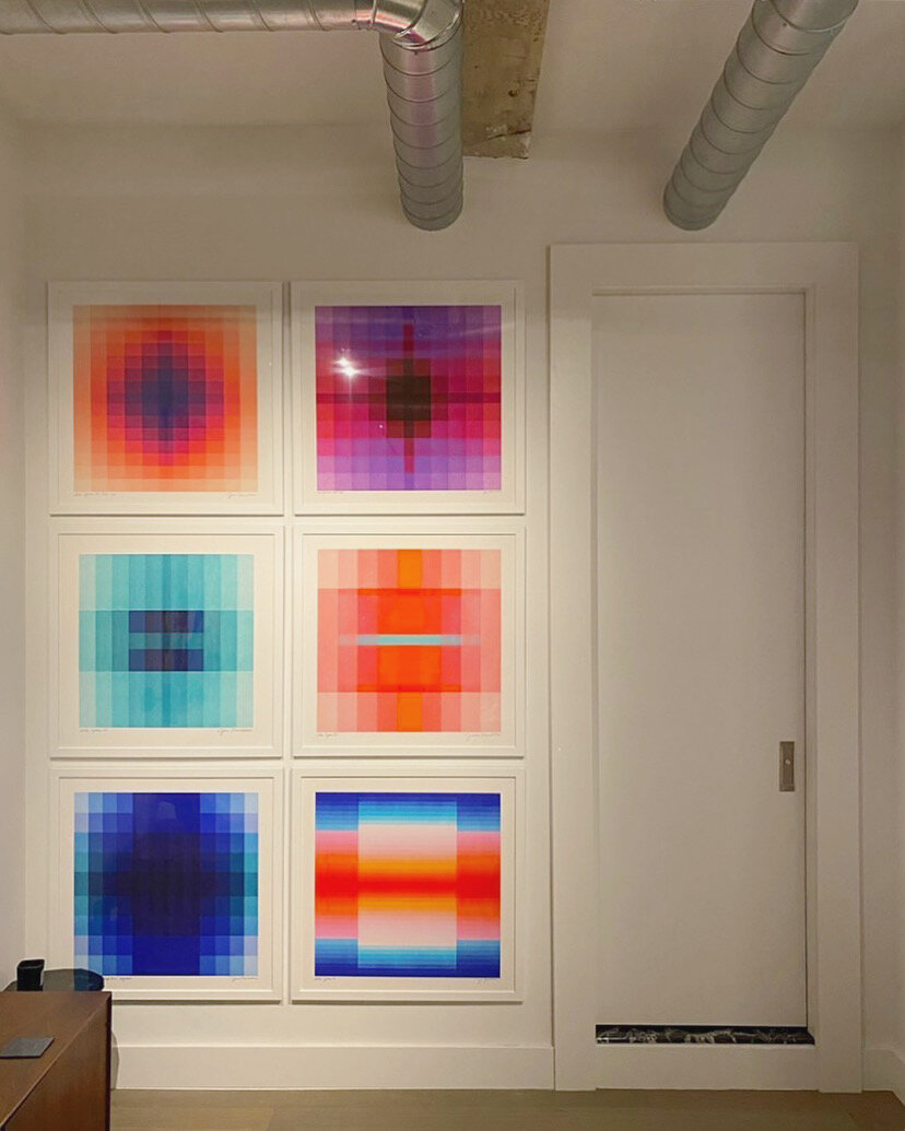
Friends can you even believe this spectacular install?
Honestly I don’t think I had dared to dream a dream where someone would create something this kapow!!! with my work but the extremely awesome Josh Machiz & his BFF artist Tom Smith had a vision for this space in his NYC apartment and they executed the eff out of it. I am absolutely blown away. Thank you Josh & Tom!!!
Need this set for your space? I’ve just added it as a gallery wall bundle in my shop so you can hit the easy button and get it! I’ve named it The Gotham in honor of its origin in New York City :)
Super-cute mini-gallery wall by Studio Llou featuring Kinetic Lines 11 in the lower right corner there! Love the minimalist western vibe!!! Yee haw! ;) 🧡🌵🧡
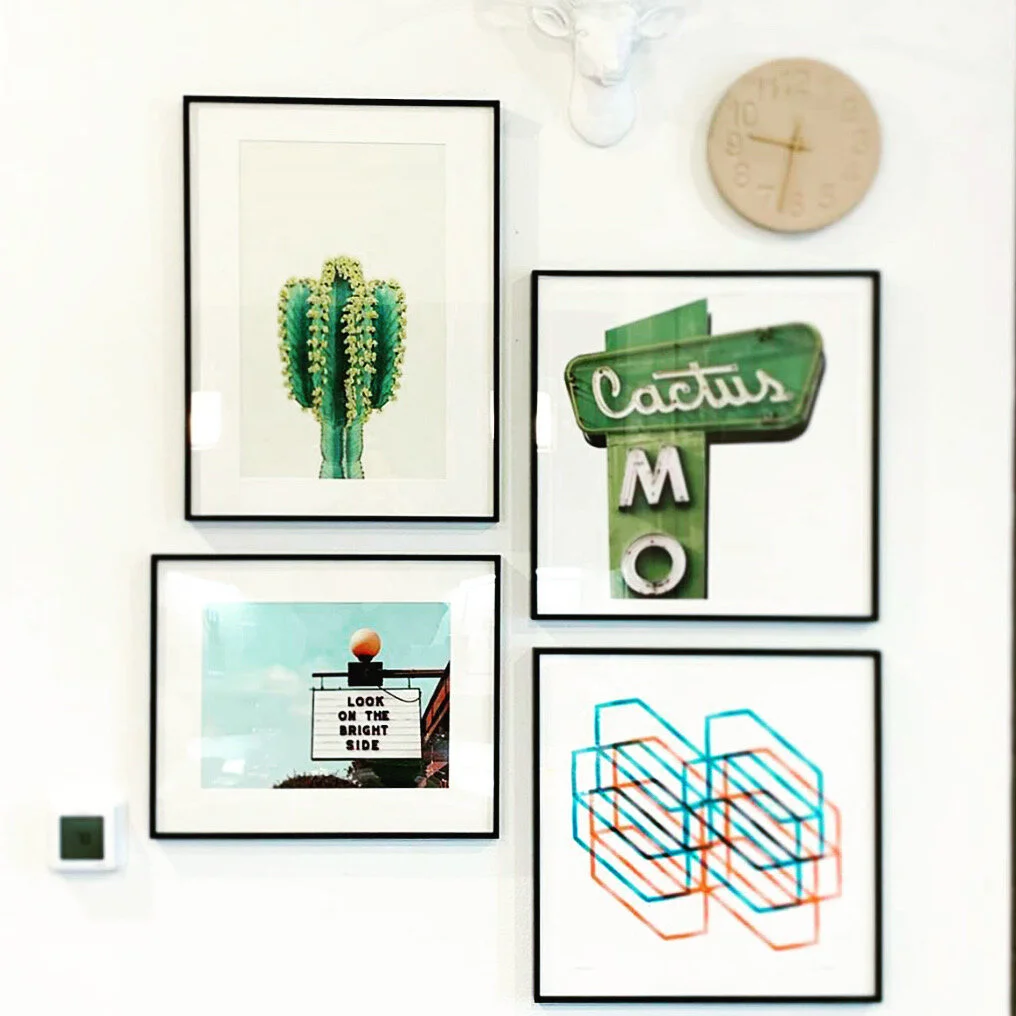
Kinetic Lines 11 looking good in a black frame in this minimalist western gallery wall!
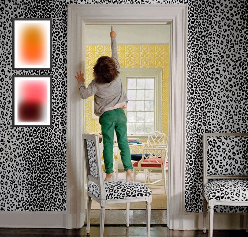
Another installment of a game I play to amuse myself: matching up my art with wallpaper!
This one is the aptly named Iconic Leopard from Schumacher. I’ve paired it with Color Cloud 6: Leave It Open & Color Cloud 16: You Never Know framed in black.
Got wallpaper & need art? Send me a pic and I’ll make recommendations!
Exciting news: the May 2020 issue of Real Simple magazine featured my piece “Keep Going 1” in the article “Let’s Hang!” written by Stephanie Sisco and Leslie Corona, and photographed by Bryan Gardner. (The online version of the article is titled 4 Smart Strategies for Creating a Stylish Gallery Wall.)
That’s the short version of the story :)
Image from the article “Let’s Hang! 4 Smart Strategies for Creating a Stylish Gallery Wall” in the May 2020 issue of Real Simple Magazine, photography by Bryan Gardner
The long version is that I had no idea this was happening and I bought this issue of Real Simple somewhat randomly and had it in my house for over a week before I opened it! I wanted to wait until I could really enjoy it, which turned out to be during some late-night-me-time: everyone else in my family was asleep.
When I got to the story on buying and hanging art I was like oh cool they got some of these pieces from Artfully Walls, which is a great website I’ve worked with for a few years now. And I was looking closely at the pieces featured on the first page of the story and mentally congratulating people.
Then I turned to page two of the story and BOOM: there it was in the fricking center of the gallery wall, my piece Keep Going 1! My jaw fell open, my heart started racing, and I just sat there and stared at it for a few beats.
Then I ran into the bedroom and woke my husband up so I could a) validate that this was not a hallucination and b) freak the flip out with another human.
When I woke up the next morning I had to look at it again to make sure it was still there. It was ;) I am still in a cloud of joy and excitement over this whole thing.
Keep Going 1 is available at Artfully Walls or here on my website, where you can also find the other pieces in the series, Keep Going 2 & Keep Going 3.
Thanks so much to all of the folks at Real Simple that made this awesome article happen!
The incredible designer Natalie Myers of Veneer Designs is now the proud owner of “Color Cloud 16: You Never Know”! It’s hanging in the den of her LA home, and I am so super stoked at how beautifully it fits into her organic modern “Scandifornia” vibe.

Here’s what Natalie had to say in her Instagram post about the piece:
“The walls we are staring at every day really do impact us, huh? Art makes a huge difference for me in changing my attitude. I fell in love with @jessicapoundstone abstracts and she rushed her printer to get this one out the door before their shop was shut down. I’m so glad she did because even though this print is meant for Ilana’s room that’s getting a makeover soon, it’s currently hanging in my favorite sunny spot of the den. I can stare at it and let my imagination take me elsewhere. It’s an amazingly meditative work and a meaningful souvenir of this time. When the quarantine is over it will move to Ilana’s room and live its best life, but for the time being it’s here to soothe all of us.”
Check out Natalie’s amazing work - and snag a piece that speaks to you from the Color Cloud series right here!
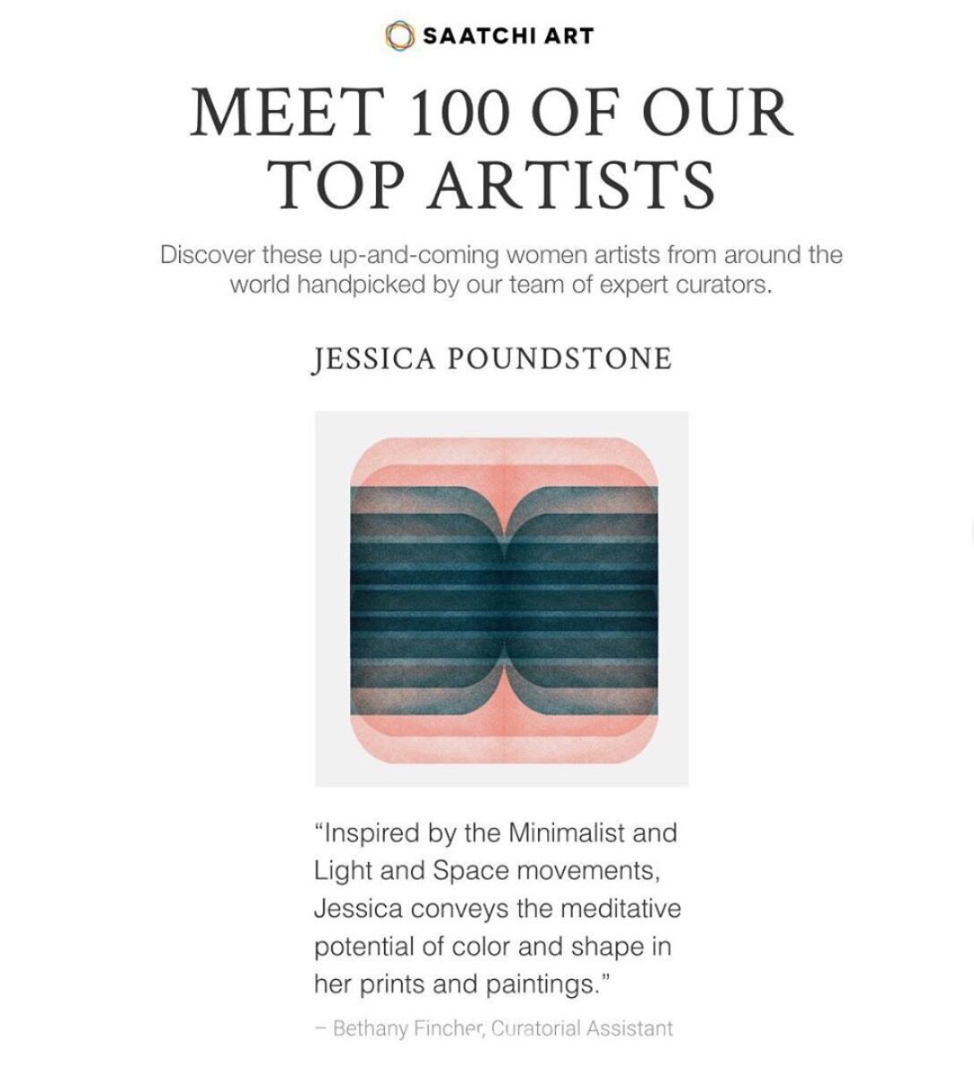
So excited and honored to have been selected by the Saatchi Art curators as a top artist - and to be featured in Saatchi Art’s spotlight on women artists in honor of International Women’s Day!!! Many, many, many feels. See all of the amazing women artists here www.saatchiart.com/stories/100artists.
Zach Tutor, curator of Supersonic, New Contemporary Art - which SF Weekly called, "So refreshing and expansive it could kind of knock you out” - kindly featured my work on his site, calling it “astoundingly wonderful” which is really just very very over the top of him. See his favorites at this link!
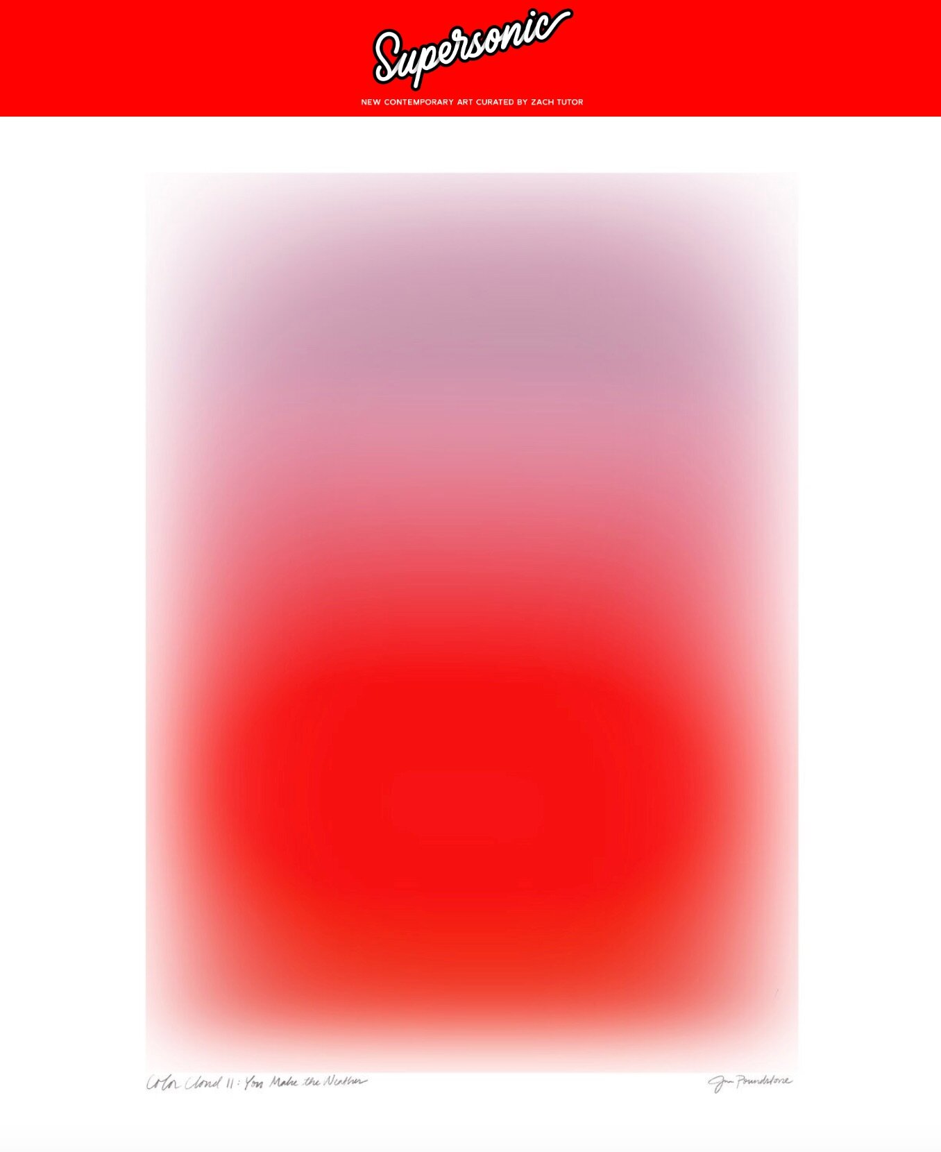
Color Cloud 11: You Make the Weather is available for purchase here
Here’s a bit more about what Zach’s up to: “Supersonic’s sole purpose, through sharing and discussion, is to chronicle the School of New Contemporary Art: A generation of creatives who have had access to infinite aesthetic inspiration via the Internet and other electronic devices…..Zach personally likes to refer to this movement as 'Deep Pop.’”
Follow Zach’s curation on Supersonic’s website and @supersonicart on Instagram!
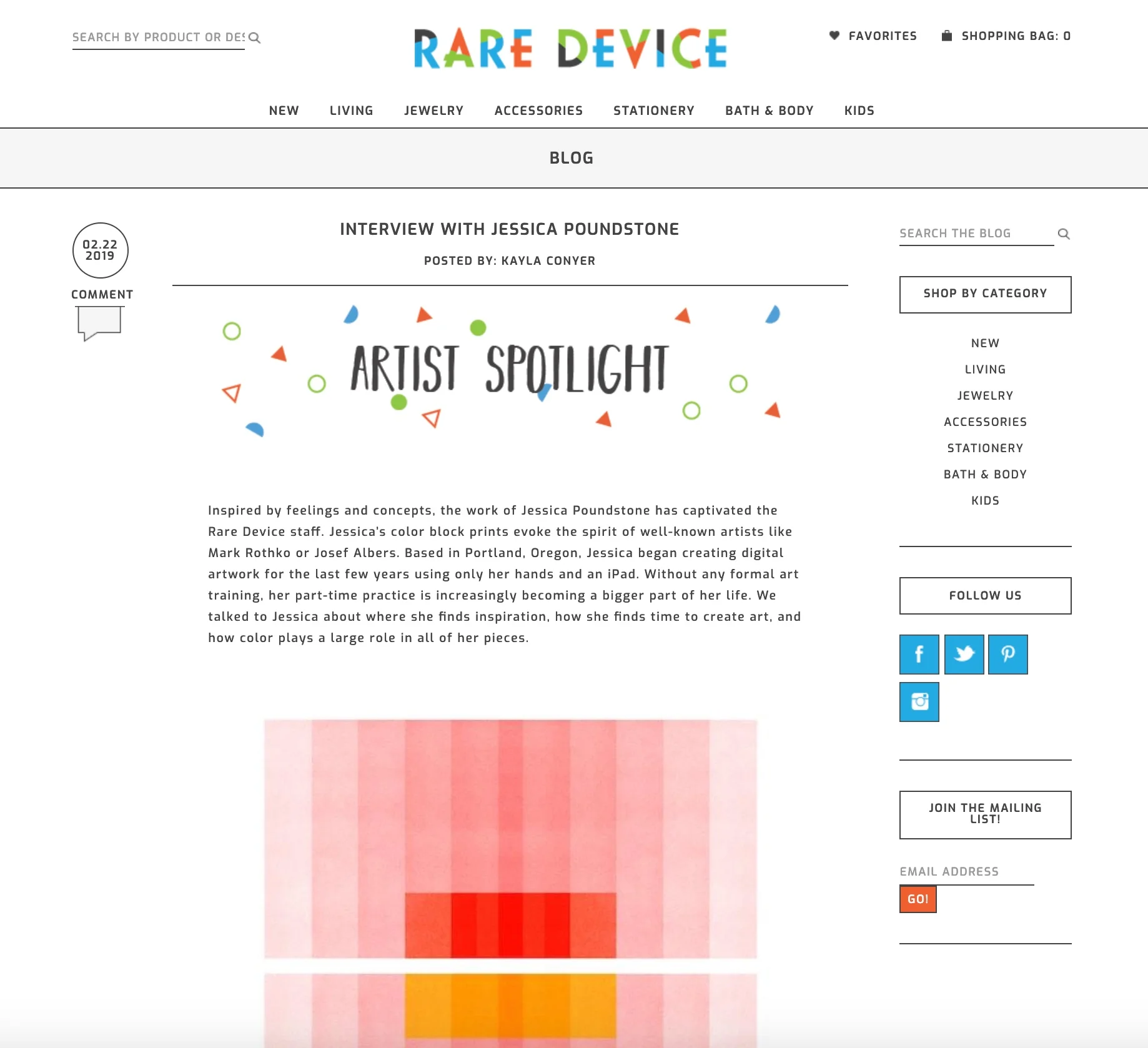
The amazing humans over at Rare Device just re-launched their website, and you should most definitely check it out. It made me remember the amazing interview Kayla Conyer did with me there earlier this year - I wanted to add the full text here as well, because I loved her questions, and I hope the answers will be interesting to you as well, whoever you are ;) Here’s a link to the original version on the Rare Device site.
Inspired by feelings and concepts, the work of Jessica Poundstone has captivated the Rare Device staff. Jessica’s color block prints evoke the spirit of well-known artists like Mark Rothko or Josef Albers. Based in Portland, Oregon, Jessica began creating digital artwork over the last few years using only her hands and an iPad. Without any formal art training, her part-time practice is increasingly becoming a bigger part of her life. We talked to Jessica about where she finds inspiration, how she finds time to create art, and how color plays a large role in all of her pieces.
KC: How long have you been creating art and what is your background? At what point did you decide that making art and putting it out into the world is something you wanted to pursue?
JP: I started making art when I was a kid and never really stopped. I didn’t go to art school — I got a degree in Humanities with a minor in writing and have worked in communications ever since. But I’ve always spent a pretty significant amount of my time looking at, thinking about, and making pictures.
It was about two years ago that something shifted for me in terms of my art: I wanted to publish the pictures I was making and felt a strong urge to just go for it. It felt less like a decision and more like a compulsion, honestly. So I started an Instagram account and just went for it. I can’t even tell you how encouraging those very first likes and comments were! The intensity of my drive to make and put my work out there hasn’t diminished much since then. I am still so energized by creating new work and exploring new ways of thinking visually.
KC: Your work is mainly digital, but so many of your pieces remind me of paintings. How did you decide to stick with digital media over more traditional practices?
JP: Over the years, I’ve tried out a lot of different mediums. Pencil, charcoal, watercolor, acrylics, gouache, screen printing, ceramics: you name it, I’ve probably tried it. But none of the mediums I explored felt like “home” to me. I had messed around with making images on my phone in the painting app Brushes (much like a simplified Adobe Illustrator, it’s a blank-canvas painting app) for a while. But I hadn’t thought of it as a primary medium I could work in until I read that David Hockney had been making work on his phone and later on his iPad (also in the Brushes app). Just hearing him say how much he liked it — and then seeing pictures of a museum show of his where they displayed his iPad images on large LCD screens — made it an intriguing possibility I felt liberated to explore.
Over several months, I experimented with making images on my phone — often during my bus ride to and from work. I created a few different techniques and processes for making minimalist pictures that I absolutely loved. The images felt like a pure expression of things I wanted to say; it felt like I had finally found my voice.
Very quickly, though, I realized that I needed to know how these images would look in print. If they were not successful I’d need to figure out a way of working them in analog because I was now committed to the style I’d developed. I did a ton of research, found a local giclée printer and sent off some files. I was absolutely overjoyed when the test prints came back looking exactly like they looked on my screen. That’s when I knew for sure that I could continue working in digital.
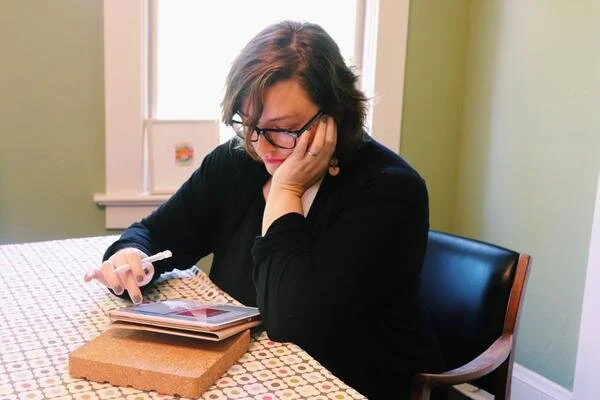
Me at my dining room table….er, I mean studio :)
KC: What is your practice like? Do you work as a full-time artist, or is creating art something you find yourself having to make time for?
JP: I have a pretty demanding full-time job, as well as family life and social life to tend to, so...yeah it’s a balancing act. There are days I find myself wishing I could work on art full time — on other days I’m glad it still feels like I’m “stealing time” to make art because that dynamic creates a certain joyful/focused energy that makes it into the work. I’ve always been a night person, so I’m often working on my art after everyone else in my family has gone to bed, between 10 p.m. and 1 a.m.
KC: What is your process for developing your work? Do you start with color, pattern, or nothing at all?
JP: I have a lot of different starting points because I am constantly getting excited by things I encounter (an article I read, artwork I see, a building I drive by, etc. etc.) and generally have way more ideas than time to execute them! Sometimes I start with a color or a color combination; other times it’s something I’ve heard or seen, or there’s a feeling or concept I want to explore. No matter the starting point, I try to let the work lead me wherever it wants to go. That’s one of the many ways digital is so freeing — I can try anything with an image and never have to worry about finding a space to work or spending money on materials. I didn’t realize how much those two factors limited my process until I no longer had to worry about them.
KC: With the exception of a few pieces that are nature-based, most of your work is very abstract. Are these forms based on real items, places, and scenarios, or are they spontaneously drawn from the unconscious?
JP: It was a big shift — and a big relief — to step away from making representational work. And yes, most of my work is coming from the unconscious and is done in “flow” — as in the Mihály Csíkszentmihályi definition of it: that state where you’re completely absorbed in and energized by the work you’re doing because you’re being challenged at the top of your ability. It’s an incredibly exciting feeling.
KC: Color is obviously a point of interest for you. What are you looking for in the connection of multiple colors on a surface? Do you want to evoke a feeling? Spark interest?
JP: Color is just such a huge gift and a mystery. It’s very much like music to me. I’m still wowed by it all the time. At the heart of it, I think what I’m trying to create with these images are beautiful, meditative spaces people can have and hold in their minds. I want them to be both a catalyst and a comfort — a way of helping people break out of habitual thought patterns, inspiring new possibilities, new ideas and new ways of thinking and feeling.
KC: Are there certain color combinations that you find yourself going back to time and time again? Do they have any personal relevance to you?
JP: I was recently cataloging my work and realized I definitely do have some colors I go back to again and again — although I couldn’t really say why, or whether there’s personal relevance there. The main one is a soft, slightly orangey pink — I’ve been really close to that color for many years, and I see that I pair it with midnight blue, egg yolk yellow and bright tomato red in a recurring way.

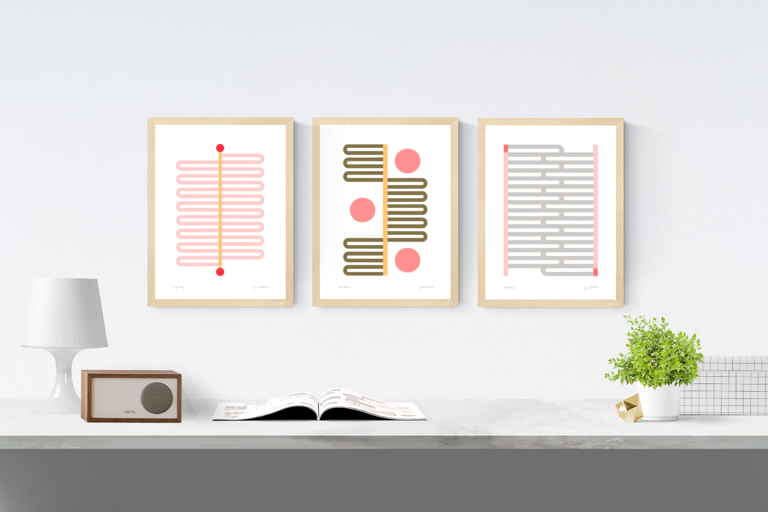
Color Space 3
KC: Do you have any projects or “dream pieces” that you’re hoping to work on/create in 2019?
JP: A crazy dream I’ve had for a long time (who knows, maybe this is the year!) is to make a light bath — a portable chamber people could step into and be in for a while to really experience a certain color or colors. In my vision, I’d buy time in various parking spots around town and people could come and just be engulfed by the color of their choice for a chunk of time. Doesn’t that sound great? If you can help make that happen, get in touch :) A more practical “dream” is to explore some surface design applications for my work — I have so many ideas for patterns! — and possibly make some work that’s really, really big.
Tilton Fenwick is a legendary New York-based design firm founded by Anne Maxwell Foster and Suysel dePedro Cunningham. The pair recently combed through the treasure trove that is Chairish and picked their favorites — including two of my pieces: Color Space 27 and Pink Zig Zags: Soft Geometry! (Shop all their picks here.)

In a related article on the Chairish blog, “Playing Favorites With TIlton Fenwick” the pair shared their love for finding art treasures on Chairish: “…there are so many artwork options to add that final layer to a room!”
Maxwell Foster and Suysel dePedro Cunningham also shared one of their favorite quotes, from Rumi: “Light your life on fire. Surround yourself with those who fan your flames.” Love it, love their style, and love being included in their world of design. Thanks to everyone who made the feature happen!
Artfully Walls has used my work in several recent features sharing fun ideas for gallery walls. Take a look and click through to learn more!

The Sour Cherry gallery wall collection features my piece Coral Structure: Soft Geometry in the center.
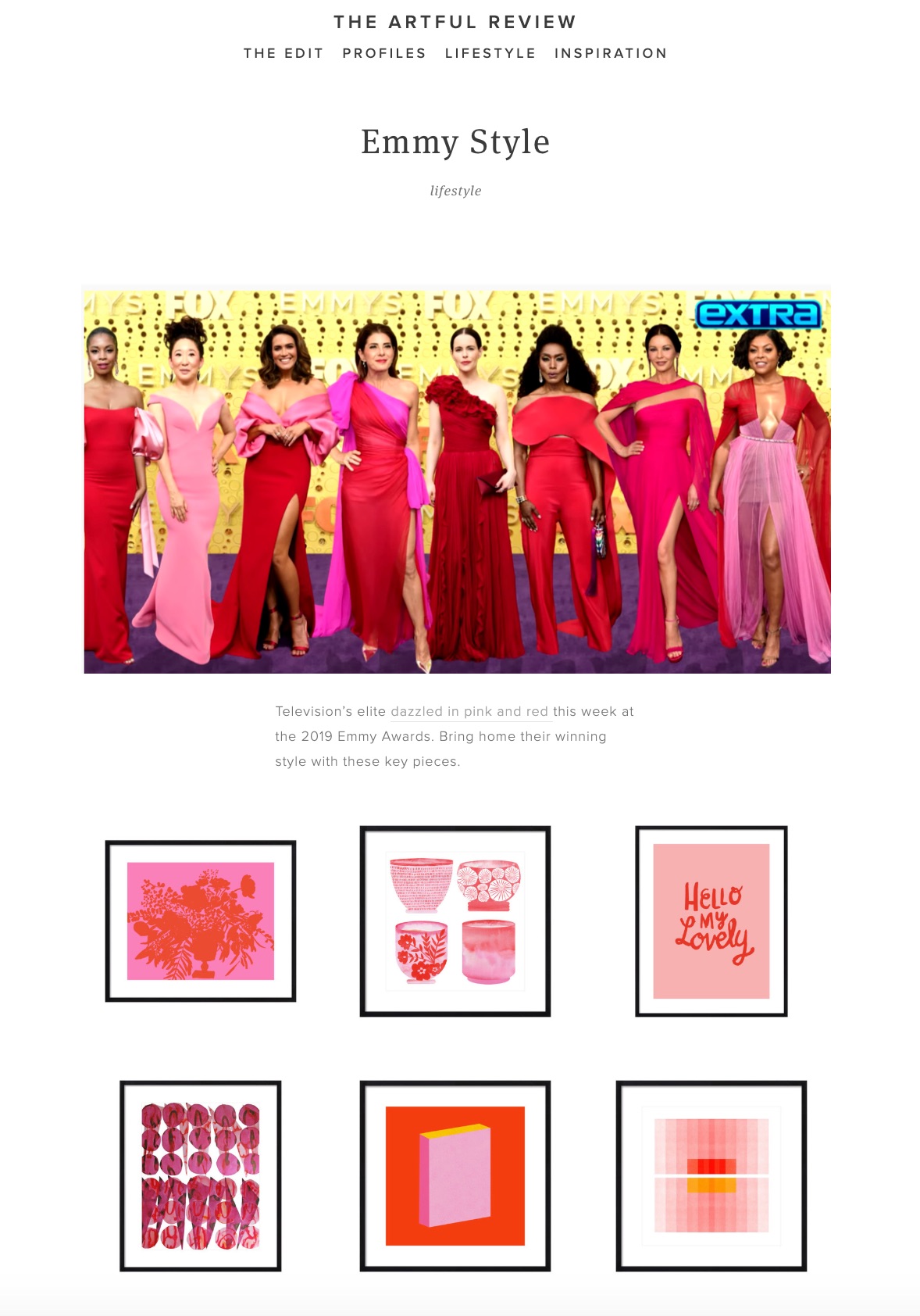
This super fun grouping of images, “Emmy Style,” was inspired by the pink + red dresses at this year’s awards. Two of my pieces are included shown here on the on the bottom row: Color Books 3, Scarlet, Pink & Gold and the ever-popular Color Space 27, Pink, Red, Yellow.
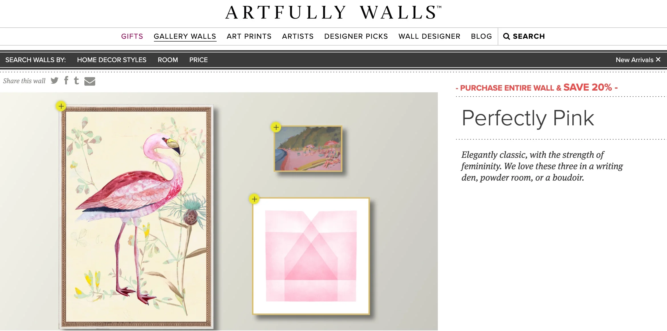
And last but not least, the Perfectly Pink gallery features my piece Soft Geometry: Pink Structure (Give Yourself the Softest Landings). “The team suggests these be placed together in a “writing den, powder room or a budoir” - three places I would love to have available to me ;)
Go check out all of the goodness at Artfully Walls! And of course you’re also free to order any of these pieces through me right here.
Thrilled to share that a piece from my Soft Geometry series, Pale Peach Structure, is now available exclusively through Anthropologie! I love how the Anthro team styled it (They even gave me a fluffy cat!). Check out the whole listing here.
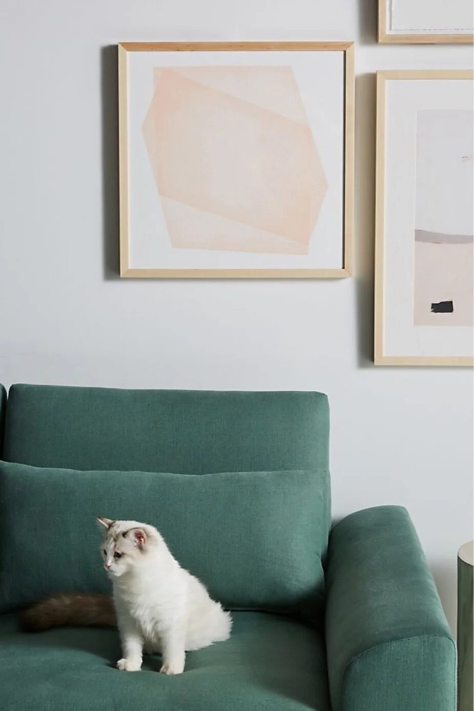
Pale Peach Structure: Soft Geometry available exclusively at Anthropologie!
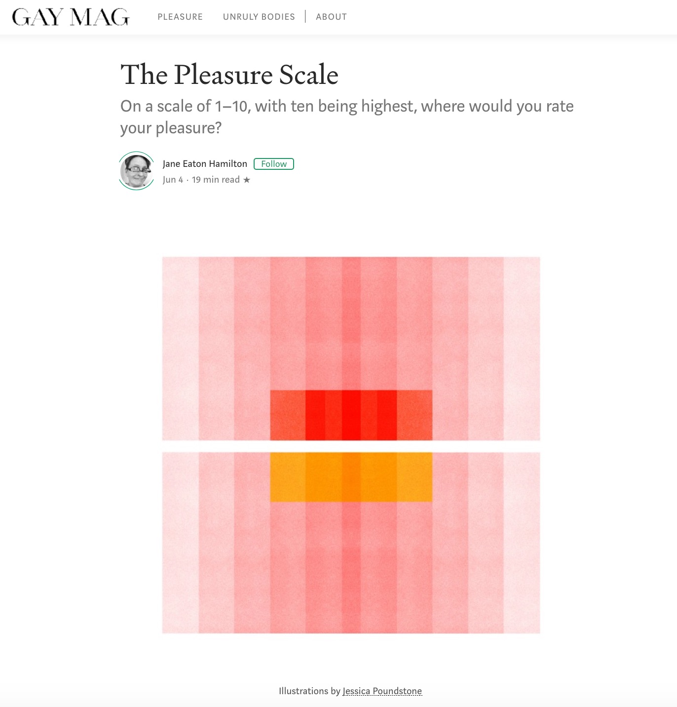
Do you know Roxane Gay?
If not, you should get to know her because she is an amazing human who - in addition to being a professor and a writer and a NYT op-ed columnist and a bunch of other cool s*** - has also started a magazine on Medium called Gay Magazine, which is “dedicated to diverse, intelligently provocative work” and “interested in deep explorations, timelessness, and challenging conventional thinking without being cheap and lazy.”
Thrillingly, they have selected six of my pieces to serve as illustrations for an article by the wonderful Jane Eaton Hamilton called “The Pleasure Scale” and I’m so thrilled and honored.
Go learn more about Roxane, Gay Magazine and Jane Eaton Hamilton.

Pleat Gallery (where I was lucky enough to have had a show in August 2018) founder Bethanie Irons called her thesis show “Friends With Benefits,” exploring the ways that artists interact with Instagram. I’m proud to be among the artists featured in it!
My contribution is on the right, below - here’s my feeling about Instagram at this moment in time: “Through Instagram I am interacting with art and artists every day and showing my work regularly. It inspires me to trust my aesthetic instincts and to keep exploring new ways of seeing, thinking and working.”

Image from Bethanie Irons Instagram account - view image here.
Learn more about the show on Bethanie’s website - and be sure to keep up with the wonderful Pleat Gallery!

Image from Bethanie Irons website - see more images of the show here.

Very excited to share that I’m the Featured Artist this week at one of my favorite art spaces online, The Gathered Gallery. There is so much good stuff curators Emily Pittman and Natalie Field share there; I’ve found so many artists I love through their work!
Here’s an excerpt from what they had to say about my work:
“Poundstone creates geometric shapes that are soft yet crisp, with transparent, textured surfaces and straight, clean edges…she is able to achieve incredibly saturated and tactile work rooted in tradition with modern technology. Each work by Jessica Poundstone is bright and engaging, with a calculated precision that is strikingly soothing.”
Go read the rest — and definitely sign up for The Gathered Gallery mailing list and follow them on Instagram! It’s such an honor to have my work there — go check it all out!
Excited to share that Rare Device in San Francisco is now carrying my work! If you don’t know about this shop, you should - I’ve followed its story since it started up way back in the day in Brooklyn, then moved to SF. Rena Tom founded it, then Lisa Congdon became a co-owner, and now it’s under the care and leadership of Giselle Gyalzen with Creative Manager Rachel Robertson and a whole bunch of other amazing folks.
From the Rare Device website: “The storefront is filled with lovely, approachably designed items for your home, yourself, and your family. Every object in the store has its own story, and has been chosen because it is either handmade, well-designed, useful, beautiful or all of the above. The aesthetic is modern and whimsical while remaining warm and inviting.” All extremely true: I love this spot in the world, so this is a bit of a dreams-do-come-true moment for me :)
In addition to carrying several of my prints (if you’re in San Francisco, go see ‘em!) they were also kind enough to publish an interview with me on their blog, which you can read right here. (Thanks again for the awesome Qs Kayla Conyer!)