Louis Vuitton Stores Feature Jessica Poundstone Artwork!

Louis Vuitton stores in Switzerland, Connecticut, China, New Jersey, Switzerland, and Korea now have my work on their walls. See how I’m saying that and NOT EVEN FREAKING OUT? Oh wait, no, I’m still kinda freaking out.

Pictured here are Connecticut and New Jersey stores featuring Color Space 62: Late Sky; Color Space 63: Inside A Peony; Color Space 40; and a custom horizontal version of Color Moment 1. Thank you to the Louis Vuitton team for showcasing my work & sharing these pictures! If you see one in the wild, let me know! Having been to the Louis Vuitton store in Paris, I can highly recommend a trip into any Louis Vuitton location: they are a wonderland of fashion and design. Happy Monday everybody!!! 🌈❤️

Jessica Poundstone artwork Color Space 40 in Louis Vuitton's Short Hills, New Jersey store.

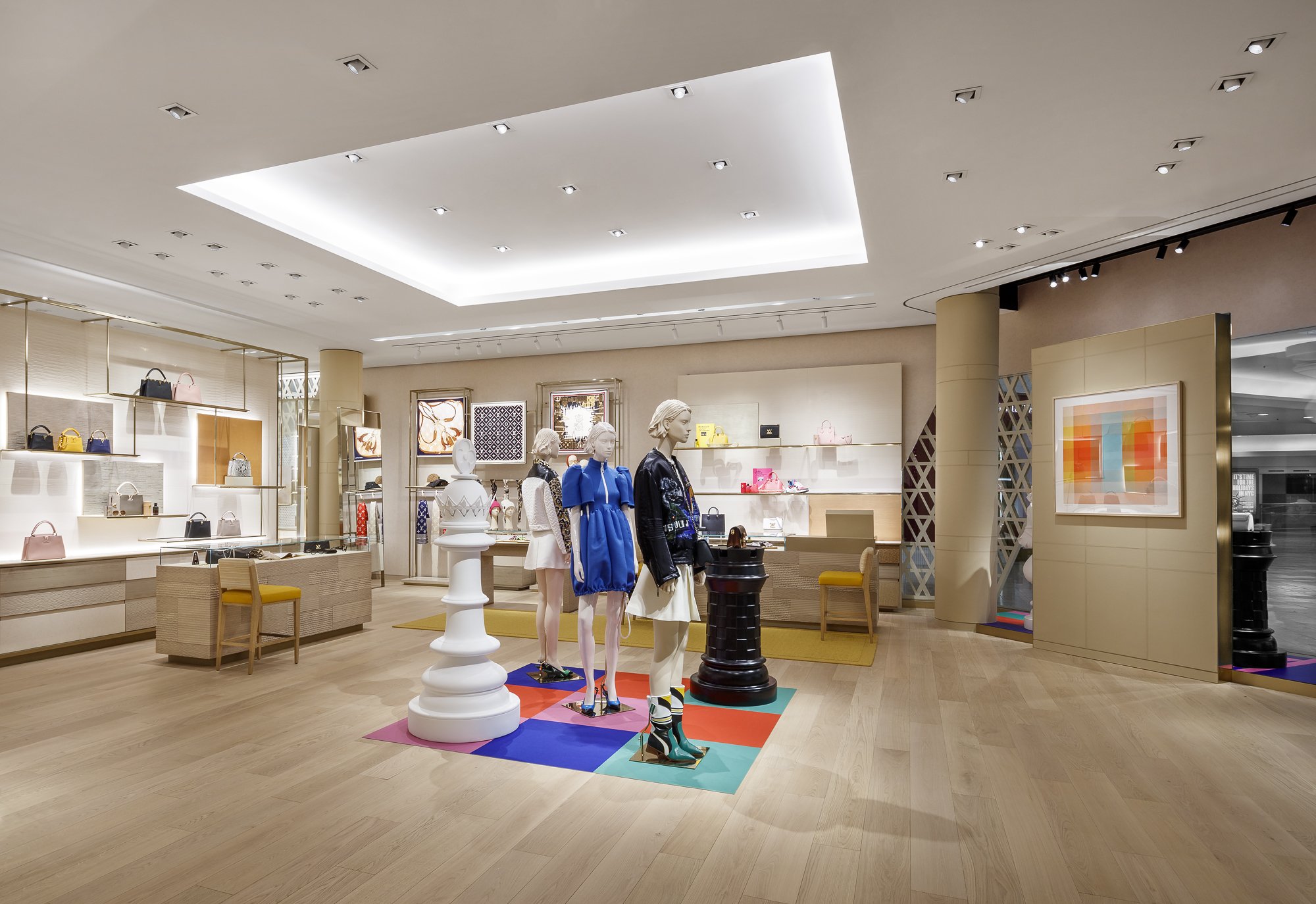
Color Space 40 in Louis Vuitton’s Short Hills, New Jersey store

Jessica Poundstone artwork at Louis Vuitton store in Natick, Connecticut - Color Space 62: Late Sky and Color Space 63: Inside A Peony.

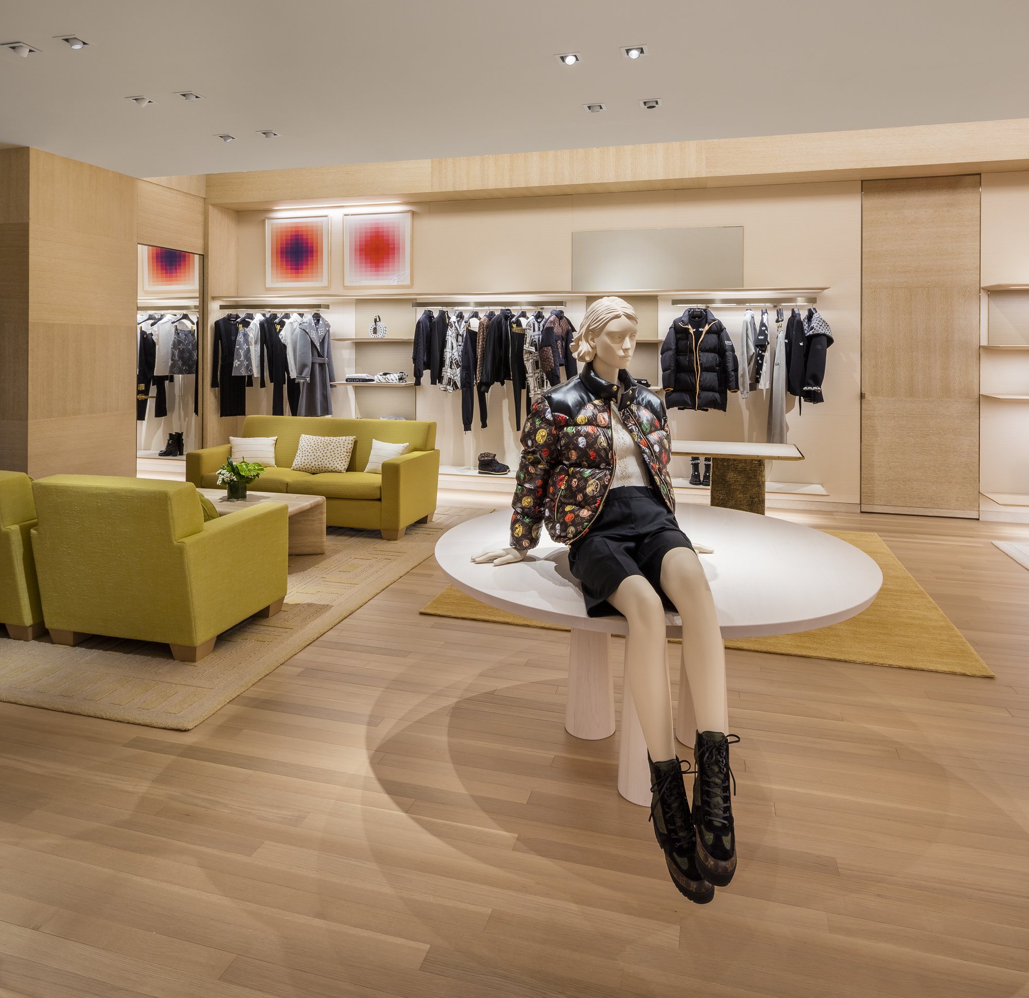
Color Space 62: Late Sky & Color Space 63: Inside A Peony in Louis Vuitton’s Natick, Connecticut store

Louis Vuitton features Jessica Poundstone's Color Moment 1 in their Short Hills, New Jersey store.

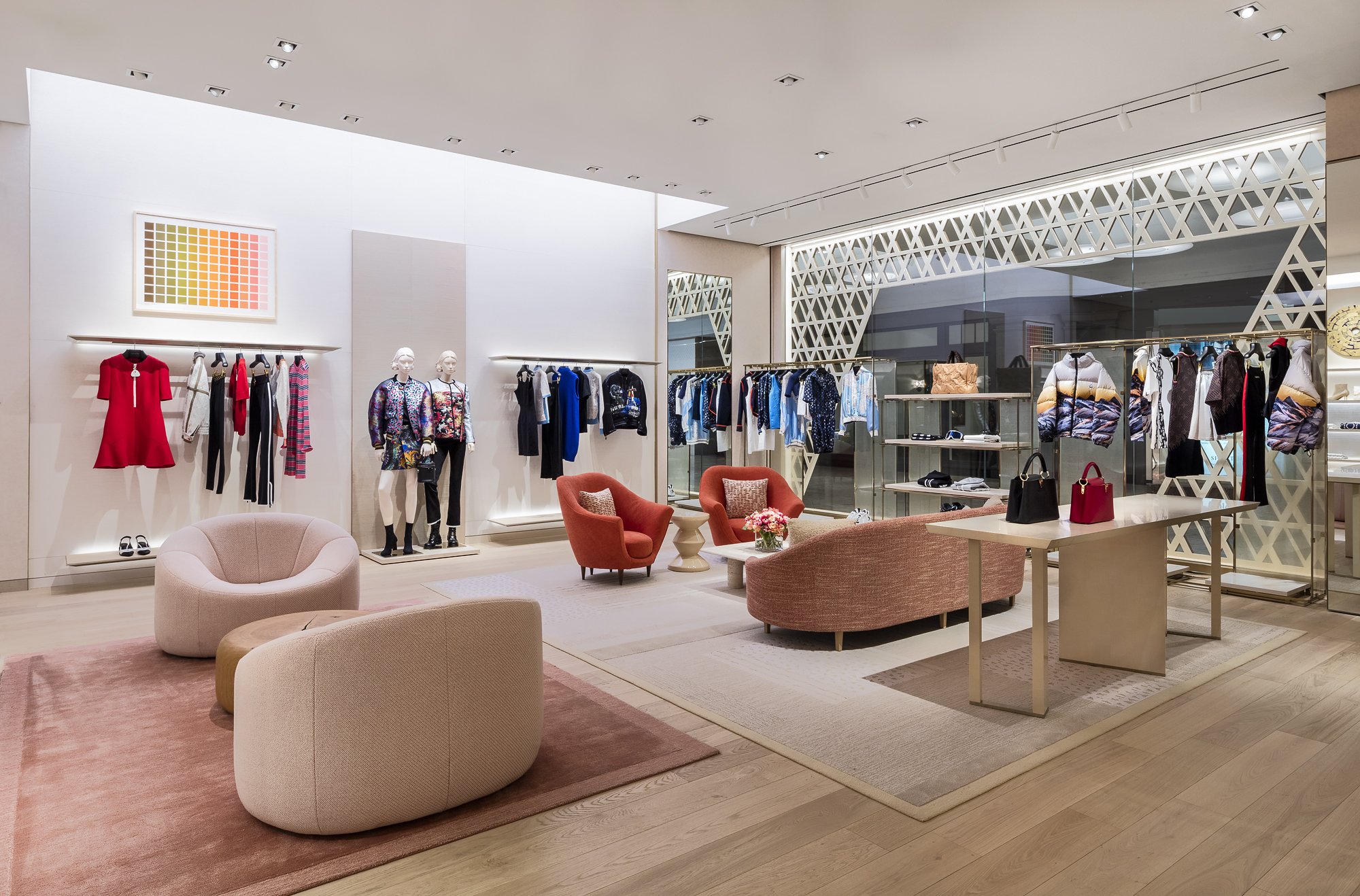
Color Moment 1 in Louis Vuitton’s Short Hills, New Jersey store

Jessica Poundstone: Artist In Residence at Paper Epiphanies - Opening Party Friday 10/8!

When Victoria, founder of the truly gorgeous and extremely awesome Paper Epiphanies asked me to be the very first artist in residence for the month of October, saying “YASSSSSSS!!!!!” was a no brainer.

We're having an opening party tomorrow, Friday 10/8 to celebrate and you're invited! We'll be hanging out from 3-7pm - there will be wine, awesome stuff and good vibes galore. (Paper Epiphanies is at 2501 SE Clinton Street.) I’ll also have a handful of my “Here For You” books, originals, mini-prints and other exciting stuff you can see/touch/feel in person!

Can't make it or don't live near here? You can still shop Paper Epiphanies online, and the cards Victoria writes are like if your BFF had been a standup comedian, and she's writing all of your cards for you. (It's like that because that's Victoria's deal, she is amazing.)

Paper Epiphanies Flagship Store Portland Oregon.jpeg

A few of my faves - quite excellent to have on hand because you know you’re gonna need 'em ;)

Hope to see some of you there tomorrow, but stop by anytime this month to see a bunch of my work in person!

My Interview on the Rare Device Website

The amazing humans over at Rare Device just re-launched their website, and you should most definitely check it out. It made me remember the amazing interview Kayla Conyer did with me there earlier this year - I wanted to add the full text here as well, because I loved her questions, and I hope the answers will be interesting to you as well, whoever you are ;) Here’s a link to the original version on the Rare Device site.


Inspired by feelings and concepts, the work of Jessica Poundstone has captivated the Rare Device staff. Jessica’s color block prints evoke the spirit of well-known artists like Mark Rothko or Josef Albers. Based in Portland, Oregon, Jessica began creating digital artwork over the last few years using only her hands and an iPad. Without any formal art training, her part-time practice is increasingly becoming a bigger part of her life. We talked to Jessica about where she finds inspiration, how she finds time to create art, and how color plays a large role in all of her pieces.

KC: How long have you been creating art and what is your background? At what point did you decide that making art and putting it out into the world is something you wanted to pursue?

JP: I started making art when I was a kid and never really stopped. I didn’t go to art school — I got a degree in Humanities with a minor in writing and have worked in communications ever since. But I’ve always spent a pretty significant amount of my time looking at, thinking about, and making pictures.

It was about two years ago that something shifted for me in terms of my art: I wanted to publish the pictures I was making and felt a strong urge to just go for it. It felt less like a decision and more like a compulsion, honestly. So I started an Instagram account and just went for it. I can’t even tell you how encouraging those very first likes and comments were! The intensity of my drive to make and put my work out there hasn’t diminished much since then. I am still so energized by creating new work and exploring new ways of thinking visually.

KC: Your work is mainly digital, but so many of your pieces remind me of paintings. How did you decide to stick with digital media over more traditional practices?

JP: Over the years, I’ve tried out a lot of different mediums. Pencil, charcoal, watercolor, acrylics, gouache, screen printing, ceramics: you name it, I’ve probably tried it. But none of the mediums I explored felt like “home” to me. I had messed around with making images on my phone in the painting app Brushes (much like a simplified Adobe Illustrator, it’s a blank-canvas painting app) for a while. But I hadn’t thought of it as a primary medium I could work in until I read that David Hockney had been making work on his phone and later on his iPad (also in the Brushes app). Just hearing him say how much he liked it — and then seeing pictures of a museum show of his where they displayed his iPad images on large LCD screens — made it an intriguing possibility I felt liberated to explore.

Over several months, I experimented with making images on my phone — often during my bus ride to and from work. I created a few different techniques and processes for making minimalist pictures that I absolutely loved. The images felt like a pure expression of things I wanted to say; it felt like I had finally found my voice.

Very quickly, though, I realized that I needed to know how these images would look in print. If they were not successful I’d need to figure out a way of working them in analog because I was now committed to the style I’d developed. I did a ton of research, found a local giclée printer and sent off some files. I was absolutely overjoyed when the test prints came back looking exactly like they looked on my screen. That’s when I knew for sure that I could continue working in digital.

Me at my dining room table….er, I mean studio :)

Me at my dining room table….er, I mean studio :)

KC: What is your practice like? Do you work as a full-time artist, or is creating art something you find yourself having to make time for?

JP: I have a pretty demanding full-time job, as well as family life and social life to tend to, so...yeah it’s a balancing act. There are days I find myself wishing I could work on art full time —  on other days I’m glad it still feels like I’m “stealing time” to make art because that dynamic creates a certain joyful/focused energy that makes it into the work. I’ve always been a night person, so I’m often working on my art after everyone else in my family has gone to bed, between 10 p.m. and 1 a.m.

KC: What is your process for developing your work? Do you start with color, pattern, or nothing at all?

JP: I have a lot of different starting points because I am constantly getting excited by things I encounter (an article I read, artwork I see, a building I drive by, etc. etc.) and generally have way more ideas than time to execute them! Sometimes I start with a color or a color combination; other times it’s something I’ve heard or seen, or there’s a feeling or concept I want to explore. No matter the starting point, I try to let the work lead me wherever it wants to go. That’s one of the many ways digital is so freeing — I can try anything with an image and never have to worry about finding a space to work or spending money on materials. I didn’t realize how much those two factors limited my process until I no longer had to worry about them.


KC: With the exception of a few pieces that are nature-based, most of your work is very abstract. Are these forms based on real items, places, and scenarios, or are they spontaneously drawn from the unconscious?

JP: It was a big shift — and a big relief — to step away from making representational work. And yes, most of my work is coming from the unconscious and is done in “flow” — as in the Mihály Csíkszentmihályi definition of it: that state where you’re completely absorbed in and energized by the work you’re doing because you’re being challenged at the top of your ability. It’s an incredibly exciting feeling.

KC: Color is obviously a point of interest for you. What are you looking for in the connection of multiple colors on a surface? Do you want to evoke a feeling? Spark interest?

JP: Color is just such a huge gift and a mystery. It’s very much like music to me. I’m still wowed by it all the time. At the heart of it, I think what I’m trying to create with these images are beautiful, meditative spaces people can have and hold in their minds. I want them to be both a catalyst and a comfort — a way of helping people break out of habitual thought patterns, inspiring new possibilities, new ideas and new ways of thinking and feeling.

KC: Are there certain color combinations that you find yourself going back to time and time again? Do they have any personal relevance to you?

JP: I was recently cataloging my work and realized I definitely do have some colors I go back to again and again — although I couldn’t really say why, or whether there’s personal relevance there. The main one is a soft, slightly orangey pink — I’ve been really close to that color for many years, and I see that I pair it with midnight blue, egg yolk yellow and bright tomato red in a recurring way.

Color Space 3

Color Space 3

KC: Do you have any projects or “dream pieces” that you’re hoping to work on/create in 2019?

JP: A crazy dream I’ve had for a long time (who knows, maybe this is the year!) is to make a light bath — a portable chamber people could step into and be in for a while to really experience a certain color or colors. In my vision, I’d buy time in various parking spots around town and people could come and just be engulfed by the color of their choice for a chunk of time. Doesn’t that sound great? If you can help make that happen, get in touch :) A more practical “dream” is to explore some surface design applications for my work — I have so many ideas for patterns! — and possibly make some work that’s really, really big.

Gallery Wall Ideas From the Artfully Walls Team

Artfully Walls has used my work in several recent features sharing fun ideas for gallery walls. Take a look and click through to learn more!

This super fun grouping of images, “Emmy Style,” was inspired by the pink + red dresses at this year’s awards. Two of my pieces are included shown here on the on the bottom row: Color Books 3, Scarlet, Pink & Gold and the ever-popular Color Space 27, Pink, Red, Yellow.

And last but not least, the Perfectly Pink gallery features my piece Soft Geometry: Pink Structure (Give Yourself the Softest Landings). “The team suggests these be placed together in a “writing den, powder room or a budoir” - three places I would love to have available to me ;)

Go check out all of the goodness at Artfully Walls! And of course you’re also free to order any of these pieces through me right here.

My Work Now Available at Rare Device in San Francisco + An Interview on the Rare Device Blog!

Excited to share that Rare Device in San Francisco is now carrying my work!  If you don’t know about this shop, you should - I’ve followed its story since it started up way back in the day in Brooklyn, then moved to SF. Rena Tom founded it, then Lisa Congdon became a co-owner, and now it’s under the care and leadership of Giselle Gyalzen with Creative Manager  Rachel Robertson and a whole bunch of other amazing folks

From the Rare Device website: “The storefront is filled with lovely, approachably designed items for your home, yourself, and your family. Every object in the store has its own story, and has been chosen because it is either handmade, well-designed, useful, beautiful or all of the above. The aesthetic is modern and whimsical while remaining warm and inviting.” All extremely true: I love this spot in the world, so this is a bit of a dreams-do-come-true moment for me :)

In addition to carrying several of my prints (if you’re in San Francisco, go see ‘em!) they were also kind enough to publish an interview with me on their blog, which you can read right here. (Thanks again for the awesome Qs Kayla Conyer!